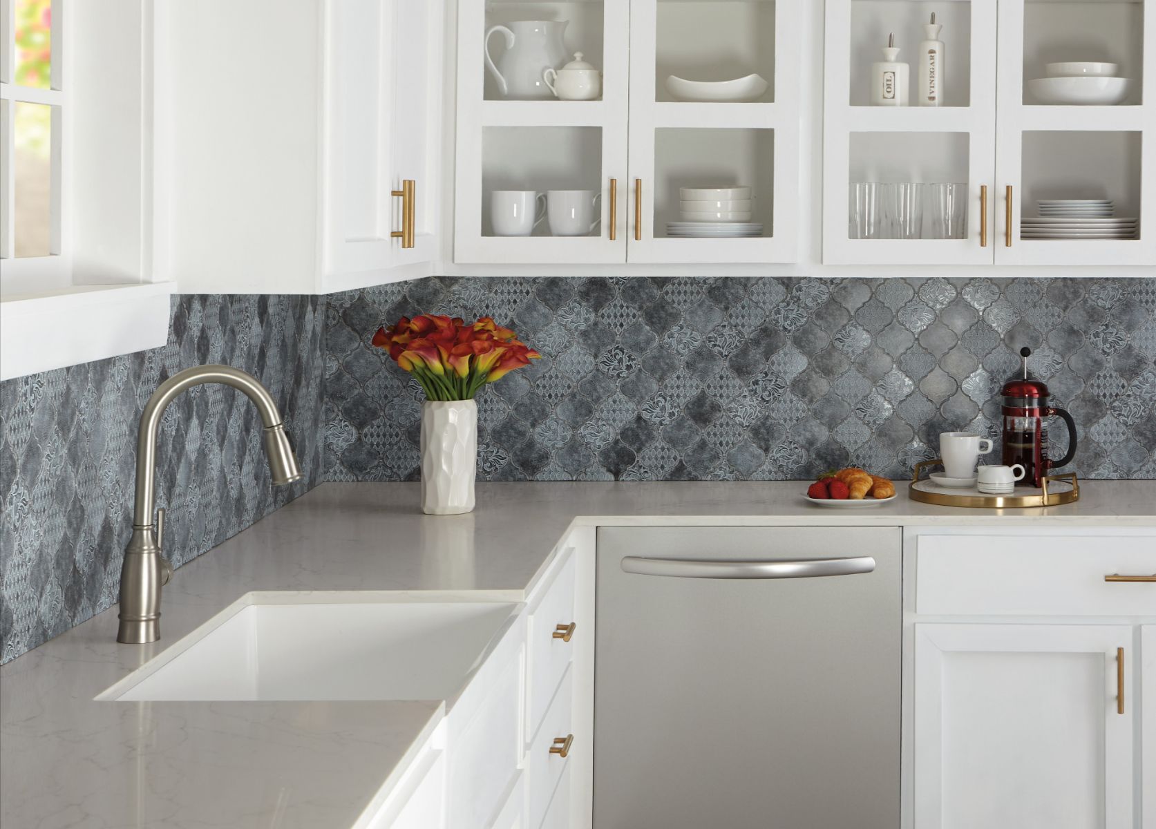
Choosing a backsplash is one of the most exciting parts of a kitchen or bathroom remodel. It is also where many homeowners hesitate. Mixing tile colors can feel risky, and no one wants a design that looks busy, mismatched, or overwhelming.
The truth is that combining backsplash colors can create depth, personality, and a polished designer look when done correctly. Instead of appearing flat or predictable, your space gains visual interest and a custom feel. The key is understanding how to blend colors intentionally rather than randomly.
At CW Floors and Lighting, we help homeowners make confident design choices every day. From flooring and lighting to full renovation projects, we guide every step from concept to completion. Mixing backsplash tile colors is a common request, and with the right strategy, it is easier than most people think.
Here is how to combine backsplash colors in a way that feels balanced, cohesive, and beautiful.
Why mix backsplash tile colors in the first place?
Some homeowners wonder if mixing colors is necessary at all. A single-color backsplash is clean and timeless, but multiple colors add visual depth and personality.
When used thoughtfully, mixed tile colors can enhance the entire space. They help connect surrounding design elements and create a more layered, custom appearance.
A multi-color backsplash can:
Add visual interest without overwhelming the room
Tie together cabinets, countertops, and flooring
Create depth and dimension
Highlight focal points such as a range or sink
Reflect your personal style
The goal is not to add more color for the sake of it. The goal is to create harmony and intentional design.
What is the easiest way to mix backsplash colors successfully?
The simplest approach is to choose one dominant color and one supporting color. This method keeps the design controlled while still allowing variation.
Start by selecting the main tile color that will cover most of the backsplash. Then choose a second color that complements it and use that color as an accent. This prevents visual competition and keeps the space feeling calm.
For example, if your main backsplash tile is white, your accent color could be:
Warm gray
Light taupe
Soft blue
Natural stone
Limiting your palette makes the result feel cohesive instead of chaotic.
How do you choose backsplash colors that work well together?
Color harmony is essential. Even beautiful backsplash tiles can clash if their undertones or intensity conflict. There are three reliable ways to create successful combinations.
Stay in the same undertone family
Warm tones blend naturally with other warm tones, and cool tones work best together.
Examples include:
Warm beige + cream + gold veining
Cool gray + white + charcoal
Mixing warm and cool tones is possible, but it requires careful planning. Staying within one undertone family is the safest choice.
Use colors already in the room
Look at surrounding elements for inspiration. Repeating colors that already exist creates instant cohesion.
You can pull backsplash colors from:
Countertops
Cabinet finishes
Flooring
Wall paint
This ensures the backsplash feels connected to the rest of the design.
Vary the shade instead of the hue
Using different shades of the same color creates depth while maintaining harmony.
Examples include:
Light gray + medium gray + charcoal
Pale blue + deep navy
Layering shades is one of the easiest ways to mix colors without clashing.
Can you mix bold backsplash colors without overwhelming the space?
Bold colors can work beautifully, but they need structure and balance. Without a clear plan, strong colors can feel chaotic.
To use bold backsplash tile successfully, try these strategies:
Use bold color only behind the range or sink
Frame bold tile with neutral borders
Arrange colors in a pattern instead of random placement
Choose neutral grout to unify the design
Balance is also important throughout the room. If the backsplash tile is dramatic, keep cabinets or countertops more subtle to avoid visual competition.
What backsplash tile patterns make mixed colors look intentional?
Pattern plays a major role in how color combinations are perceived. A structured layout helps variation look deliberate rather than scattered.
Patterns that work well with multiple colors include:
Stacked or offset rows: This layout keeps lines clean and organized, making it ideal for subtle color variation.
Herringbone: Herringbone adds movement while maintaining control. It works especially well with two complementary colors.
Mosaic blends: Pre-mixed mosaic tiles combine colors in balanced proportions, removing much of the guesswork.
Gradient or ombre layouts: Gradual transitions from dark to light create a modern and artistic effect when installed carefully.
Testing backsplash tile samples and layouts before installation helps confirm that the pattern and color mix look right in your space.
How much contrast is too much?
Contrast should enhance the design, not dominate it. Too much contrast can make a backsplash tile feel fragmented rather than cohesive.
A helpful technique is the squint test. Step back and slightly close your eyes while looking at the design. If one color immediately overpowers everything else, the contrast may be too strong.
Balanced contrast creates visual layering. Extreme contrast creates distraction. Softer transitions usually feel more timeless.
Should grout color match or contrast?
Grout has a significant impact on the final appearance of a backsplash tile. It can either blend colors together or emphasize tile shape and pattern.
Most homeowners choose grout that supports the design rather than competing with it.
Good options include:
Matching the dominant tile color for a seamless look
Choosing a shade between tile colors to soften contrast
Selecting a subtle contrast to highlight pattern
Grout that blends often creates the most cohesive result.
How can you be confident your backsplash will look amazing?
Follow these core principles:
Choose one dominant color
Stay within one undertone family
Limit accent colors
Use structured patterns
Balance contrast carefully
Test samples before installing
Thoughtful planning leads to confident design decisions.
Your home for high-quality kitchen backsplash tiles in San Antonio and Rockwall, TX
Mixing backsplash tile colors does not have to feel intimidating. When colors relate, patterns provide structure, and contrast stays controlled, the result feels polished and intentional.
If you are planning a remodel, CW Floors and Lighting is ready to help. From flooring and lighting to full-service remodeling, we provide expert guidance and professional installation every step of the way. Our showrooms in San Antonio and Rockwall, TX, serve San Antonio, Denton, Rockwall, Dallas, and Fort Worth, TX.
Let’s create a backsplash that brings your entire space together.